Seeing Red (and Blue, and Green): How Color-Driven Stock Photo Choices Shape What Customers Actually Do
Here's something most people don't think about when they're browsing stock libraries at 11 p.m. trying to find the perfect image for a landing page: the colors in that photo are doing a lot of heavy lifting.
Not just aesthetically. Psychologically.
Color psychology has been a cornerstone of marketing for decades, but the way it intersects with licensed stock photography is something creatives are only recently getting intentional about. It's not enough to find a technically beautiful image anymore. The best designers and brand strategists are asking a different question — how does this image make someone feel, and does that feeling drive the behavior we want?
Why Color in Stock Photography Hits Different
When you're building visual assets from scratch, you control every pixel. But when you're licensing stock photography — which the majority of US brands, agencies, and solo creatives do on a regular basis — you're inheriting a color world that someone else built. That means your selection process has to be deliberate.
Research consistently shows that color accounts for up to 90% of a snap judgment about a product or brand. That stat gets tossed around a lot, but think about what it means in practice. A hero image on a homepage, a lifestyle photo in a paid social ad, a thumbnail for a blog post — these images are making impressions before a single word gets read.
So when a creative professional picks a stock photo featuring warm amber tones and soft, golden-hour light for a food brand's campaign, they're not just going for "pretty." They're deliberately invoking feelings of comfort, nostalgia, and appetite. That's strategic visual storytelling, and it starts in the licensing search bar.
The Big Four: Color Moods That Drive Real Results
Let's get practical. Here are four dominant color psychology frameworks that experienced creatives use when filtering through stock libraries:
Blue: Trust, Calm, Authority Blue is the workhorse of corporate and healthcare marketing for a reason. It signals reliability and professionalism without screaming for attention. Brands in finance, insurance, and tech lean heavily on blue-dominant stock imagery — think clean office environments, confident professionals against cool-toned backgrounds, or technology close-ups with cool lighting. If your campaign goal is building credibility, blue-forward licensed images are your friend.
Red and Orange: Urgency, Energy, Appetite Retail and food service brands know this palette well. Red creates a sense of urgency (hello, clearance sales), while orange sits in a sweet spot of enthusiasm and warmth without the aggression. Stock images featuring bold red accents, vibrant food photography, or high-energy lifestyle shots in warm tones perform particularly well in conversion-focused campaigns where you need someone to click now.
Green: Health, Growth, Sustainability The wellness boom has made green-dominant stock photography incredibly sought after. Natural textures, outdoor settings, plant-heavy compositions — these visuals communicate authenticity and environmental consciousness. Brands in the organic food, fitness, and eco-friendly product spaces are licensing these images at record rates, and for good reason. Green imagery consistently tests well with consumers who prioritize health and sustainability values.
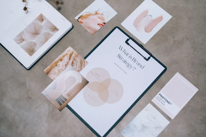
Neutral and Muted Tones: Sophistication, Minimalism, Premium Feel Creamy whites, warm beiges, soft grays — the luxury and lifestyle sectors have made muted palettes their signature. Think high-end skincare brands, boutique hotels, or premium DTC products. When creatives license stock photography with this kind of restrained color story, they're communicating that the brand doesn't need to shout. That quiet confidence reads as premium to a lot of American consumers.
Real-World Scenarios: Color Strategy in Action
Let's look at how this plays out across different verticals.
A mid-sized US health insurance company revamped their digital ad campaign by specifically filtering for stock images featuring soft blue and white palettes — families in bright, airy spaces, doctors with warm but professional expressions against neutral backgrounds. The visual consistency wasn't accidental. Their creative team had mapped color choices directly to their core brand promise of safety and reliability. Click-through rates on those ads outperformed their previous campaign assets by a significant margin.
On the flip side, a direct-to-consumer snack brand launching a new line of bold, spicy flavors deliberately sought out licensed images with high-saturation reds and deep oranges — dynamic food shots, expressive people mid-laugh, energetic kitchen scenes. The color story communicated the product's personality before anyone even read the tagline.
A sustainable apparel startup leaned into earthy greens and raw textures — outdoor photography, natural fiber close-ups, candid moments in forest and field settings. Their licensed imagery library became a cohesive visual language that resonated with their environmentally conscious target audience and drove strong engagement on Instagram and Pinterest.
How to Build a Color-First Search Strategy on Stock Platforms
If you're not already searching for stock photography with color intent, here's a simple framework to start:
-
Define your emotional goal first. What do you want someone to feel within three seconds of seeing your image? Write that down before you open a search bar.
-
Use color descriptors in your search terms. Don't just search "business woman." Try "business woman warm lighting" or "professional portrait cool tones blue background." You'll be surprised how much more targeted your results become.
-
Filter by mood, not just subject. Many stock licensing platforms allow you to filter by tone or style. Use those tools. An image of a coffee cup shot in moody, dark tones tells a completely different story than the same subject in bright, airy natural light.
-
Build palette boards before you search. Pull your brand's hex codes, identify the emotional territory you're working in, and use that as your visual compass when browsing licensed image collections.
-
Test color variants when possible. If you're running paid campaigns, A/B testing images with different dominant color palettes against the same audience can yield powerful data about what actually converts for your specific market.
The Bottom Line
Licensing stock photography is one of the most cost-effective ways to build a visual brand — but only if you're treating it as a strategic decision rather than a shortcut. The colors in the images you choose are communicating something to your audience whether you intend them to or not. You might as well be intentional about what they're saying.
At Stockpholio, we believe that every creative vision deserves imagery that works as hard as the idea behind it. That starts with understanding the invisible language your visuals are already speaking — and making sure it's saying exactly what you need it to say.